GRAPHIC DESIGNER & ILLUSTRATOR
Industry
CD & Records
Services
Branding & Loyalty Cards
If I weren't a graphic designer, I would have loved to be a baker or own a record shop. To bring that dream to life, I created the branding for "Rhythm Happy," a vibrant record store inspired by Riot Grrl culture. It combines punk rock with a diva flair, perfect for any girl dancing to the Ramones in her bedroom.

Personality
Fun, Grunge, Bold
LOGO DESIGN


For Rhythm Happy's logo, I began with the phrase that inspired the name: "Don't get trigger happy." This captures a spark of chaotic energy, but I wanted to transform it into a vibrant love for music. Instead of using the obvious gun imagery, I chose to depict a finger gun shooting musical notes. I paired this with bold text and playful script to balance the punk vibe and reflect the woman-owned nature of the brand. For the secondary logo, I combined these elements to create a bazooka out of the letter "y."


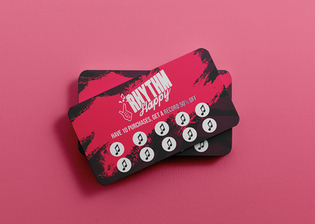
Get Rhythm Happy Loyalty Card
To enhance Rhythm Happy's loyalty cards and other marketing materials while reinforcing their riot grrrl identity, I incorporated elements such as graffiti, ink scribbles, and splotches. These additions add texture and a bold personality to the vibrant pinks and reds used in the design.
Initially, I planned to make the red tones the primary focus of all their marketing materials and cards. However, I found that the hot pink and magenta complemented the logo and color combinations much better.


