Riverstone
Logistics
BRANDING & UX/UI
Riverstone Logistics is a leader in final-mile shipping, serving reputable brands such as Ashley Furniture and Lowe's. The company is built on Christian values of service and trust, and it continues to embrace a mindset of love, service, and continuous improvement.
In designing their marketing materials, I focused on revitalizing their internal loyalty programs and groups, while also showcasing new ideas for company growth and enhancement. They granted me creative freedom to integrate my illustration skills with their established assets.
Role
Deliverables
Graphic Designer
Internal & External Marketing Collateral & Brand Design
Industry
Year
Logistics & Transportation
2023

THE CHALLENGE
Engage internal and external communities and collaborate with communcations to create brand and marketing kits, internal news updates and maintain collateral design library.
THE SOLUTION
Maintain weekly internal company updates, design dynamic marketing kits to expand with market changes. Create base website landing page and graphics.
THE IMPACT
Higher engagement within regional fulfillment factories & partners.
Established marketing kit for current and future tradeshows.
Brand kit for potentional company expansion from furniture to perishable goods.
MY ROLE
Primary Graphic Designer for Communications and HR department. Leading design concepts from HR direction to completion.
BRAND IDENTITY - RLX FREIGHT
RLX Freight is a innovative project aimed at expanding RLX's network beyond furniture and appliances to include textiles, food, and other products.
Taking the existing structure final mile logo we upgraded with a contrasting red alongside the orginal deep navy. Not disrupting the orginal brand but adding the personality of the new freight addition.
BRAND IDENTITY - PROJECT WILDFIRE
A collaboration with GE Appliances for a volunteer out reach program. Taking the concept from the mutual interest of The Lord of the Rings, a variation of the "everlasting fire" was concepted to blend the brand identity with the fantastical element but not change the tone of the objective.


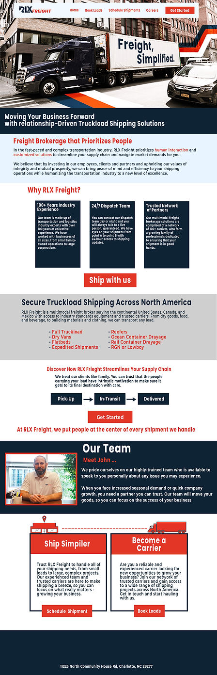
UX/UI WEBSITE CONCEPT - FREIGHT
Building upon the original website design, updating the green to red and adding a neutral light blue color to contrast and not overwhelm against the navy. Additionally, incorporating graphic lines to illustrate the cross-country shipping of these new resources.
Action buttons used red to show urgency and target important information, while the navy and grey were used for secondary information. Their website menu bar was simplistic for quick turnaround for new drivers and the demand for prioritized shipping.
ILLUSTRATIONS
Illustrations created for RLX experimented with geometric designs to reflect box trucks and the company's strength. Other marketing illustrations took inspiration from famous Bible stories such as David and Goliath.
Illustrations were used for internal bonus marketing and banners for social media platforms.

